We’ve talked about the most common design mistakes we see often before but honestly, there are a lot of other small design mistakes we see often enough that are worth being mentioned too.
These are not the obvious biggest mistakes you would see in a home. But these are the little mistakes that a professional would notice right away. And the kind of mistakes that makes your whole design feel a bit off, if you know what I mean. They are also the kind of design mistakes you would never see in a home of a designer.
It’s not fun to point out mistakes or to have mistakes we’ve made pointed out. But we know that knowing what the mistakes are, undeniably means that you now have the power to fix them. Or better yet, even avoid them.
Images via Pinterest.
Using one accent colour everywhere in a room
Of all the small design mistakes, I see this more often than I’d like to and I know why. I’m talking about using one accent colour for pretty much everything in the room.
Let me give you an example. My Mom bought a navy blue rug for her living room while back and it bugged me for a long time. I couldn’t put a finger on it until recently.
My Mom has great taste so I know she would’ve picked something wonderful for her living room. But this rug bugged the heck out of me.
I realized what was bugging me was that almost everything in her room was navy blue. The rug, the accent chairs and the accent pillows were all the same navy blue. It made the room feel flat and boring.
We changed to the rug and the throw pillows and the room looks fantastic.
Let me illustrate a similar before and after in a moodboard.
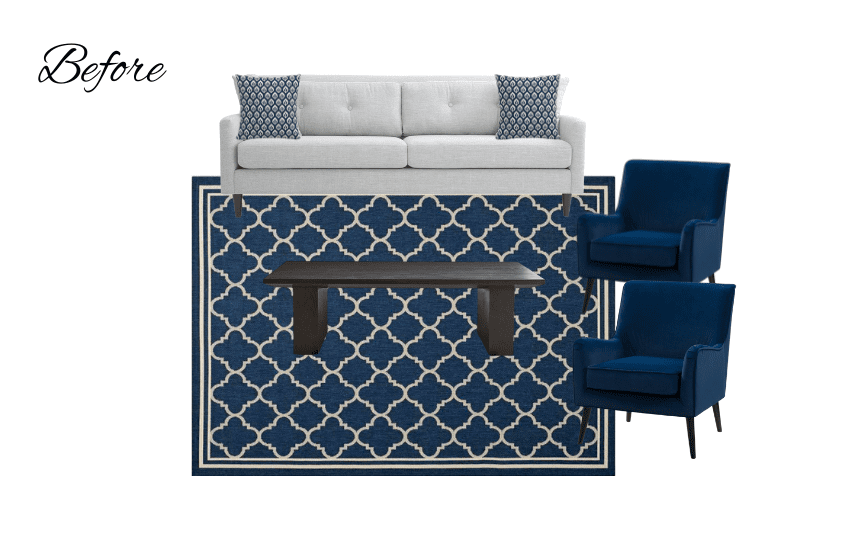
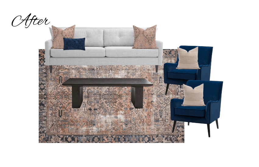
>> Pro tip: Choose at least 3 colours for your room and vary the tones and shades of each colour in various pieces.
Hanging your curtains incorrectly
This one is easy to get wrong because there’s a lot of inaccurate advice out there in the interwebs. So, we are going to set the record straight here.
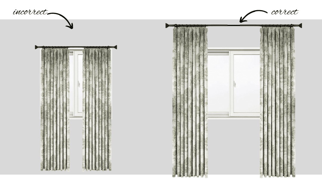
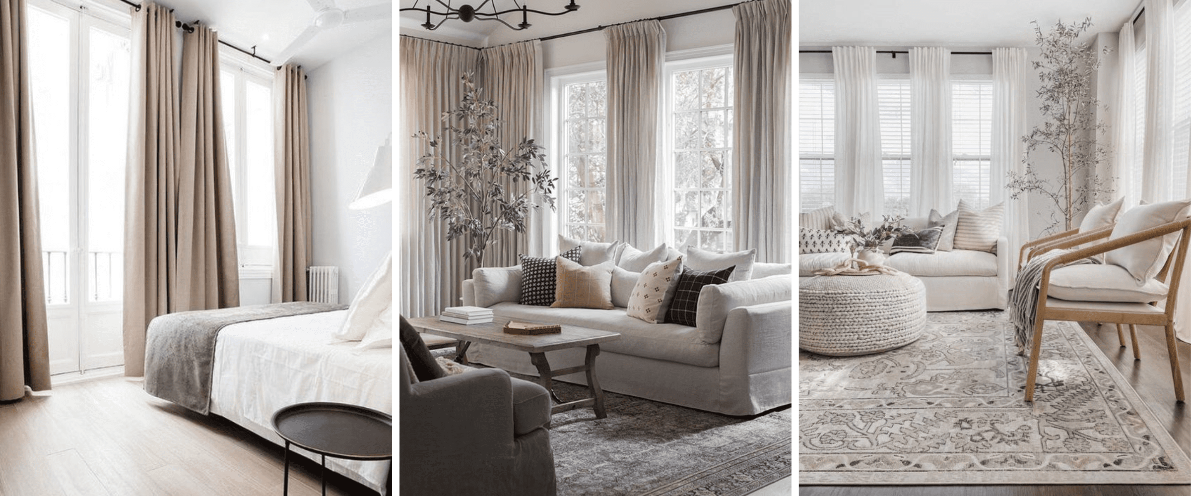
Believe it or not the sad looking window on the left is the same size as the window on the right. This is why I often say curtains have magical powers.
On the left we have the incorrect hanging of curtains. The curtain rod barely extends beyond the window; curtains are hung at the top of the window frame; and the curtains are too short in length. The one thing the picture on the left gets right is the volume of curtain fabric on the panels.
Now let’s look at the window on the right. Notice how the curtain rod extends well beyond the width of the window. This makes the window look and feel larger.
Notice that the curtains are also hung higher than in the window on the left. This makes the window feel bigger as well. But it also makes the ceiling of the room feel higher.
But here’s where some people get it wrong. Very often, interior designers tell people to hang curtains as high as they can. Some homeowners take this advice and hang the curtains almost at the ceiling. That’s too high. Leave some breathing room for the curtains. Position your curtain rod a few inches below the ceiling if you can.
Now notice the length of the curtains. They are just touching the ground.
Images via Pinterest.
Word art featuring cliches
I’ll start by saying I’m a fan of the right kind of word art. When the words have special meaning for you. And when they are not cliches like “Home is where the heart is” or “Family” or “Live.Love.Lough”.
I once gave a close friend a wedding gift that had their vows to each other engraved on an acrylic plaque that still to this day sits on their bedroom dresser.
I’ve always wanted to have a word art created for my home showing all of the places I’ve had the chance to live in or the places I love around the world. Haven’t found something I love yet but this is something I want to have made someday.
This is what I mean by word art that means something to you.
If there’s a verse or some words that have meant a lot to you, here are a couple of ways you could incorporate it in your home.
Get a custom wallpaper created with the verse you like and use it in a specific space where it works with the rest of the decor. Second idea is to choose word art that is vintage or pop art that you love.
World of word art is tricky. Tread with caution.
Images via Pinterest.
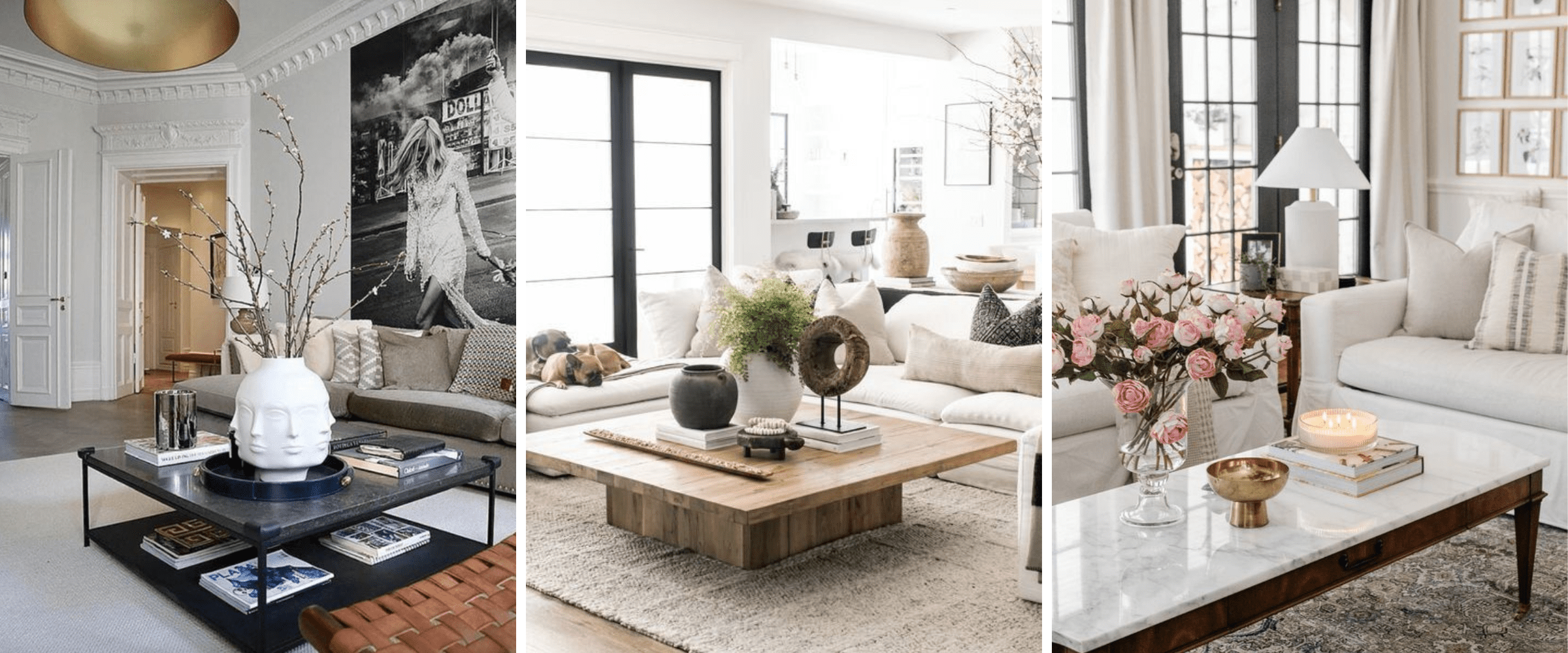
Bare, undecorated surfaces
When you don’t style your surfaces like a coffee table or the top of your dresser, it makes your space look and feel unfinished.
That means in your living room, decorate the top of your coffee table, side tables and the fireplace mantle, if you have one.
In the bedroom, this is your dresser and nightstands. In the entryway, this might be a console table.
Images via Pinterest.
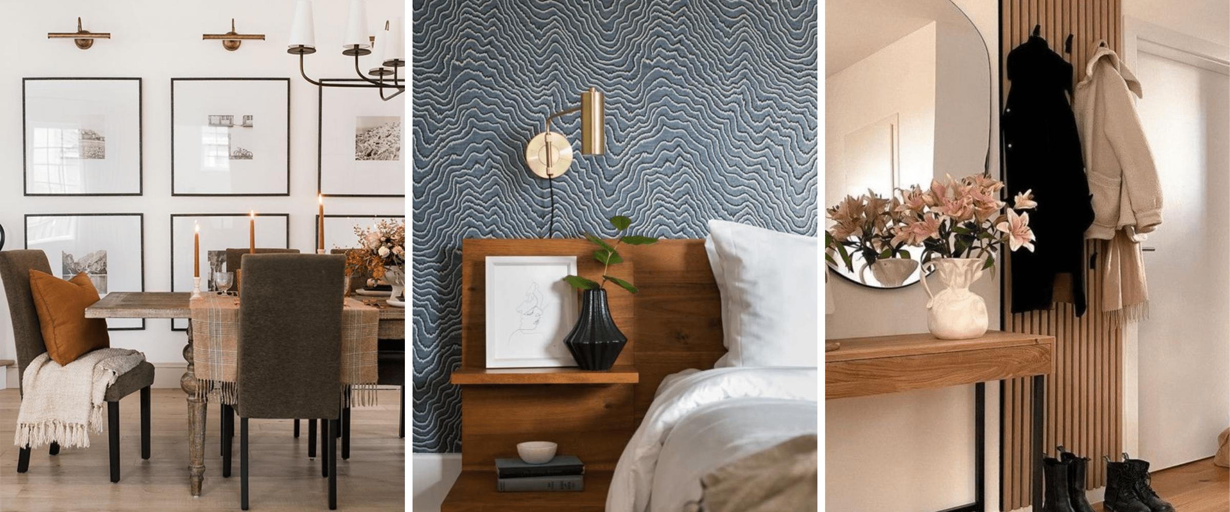
Forgotten walls
Similar to the bare surfaces, forgotten walls can make your space feel unfinished.
Design is all about layering and your walls are one of those layers. Create interest in walls using wallpaper, artwork, shelves, wall sculptures, gallery walls, etc.
If you don’t have a focal point, decorating a wall is a great way to create a focal point in a room.
All of these small design mistakes are around getting the balance right in your room. Well, except the word art one, I suppose. That one is all about not being a cliche.
Now you know them. And you also got ideas on how to fix them.
Don’t want to make expensive design mistakes? Work one-on-one with our experts to help you reimagine your home without all the guesswork. Learn more about our offerings here.


