A friend of mine recently reached out after she and her husband bought their first home (yay! I’m always so excited when someone hits that milestone). Her first question: “What colours should we paint our walls?”
It’s one of the most common questions I get—from both clients and friends. You get the keys, walk into your new space, and suddenly feel the urge to grab a paintbrush. But then… what colour?
Here’s what I told her—and what I tell just about everyone:
Paint should be one of the last things you choose.
That always surprises people.
The reason? Your wall colour in each room should be part of a bigger plan—a coordinated palette that brings everything together. Even more importantly, that plan should start with a whole home colour palette.
Cue the lightbulb moment. That’s usually when someone says:
“Wait… what’s a whole home colour palette? And why does that matter?”
If you’ve ever asked yourself the same thing, you’re in the right place. Let’s break it down.
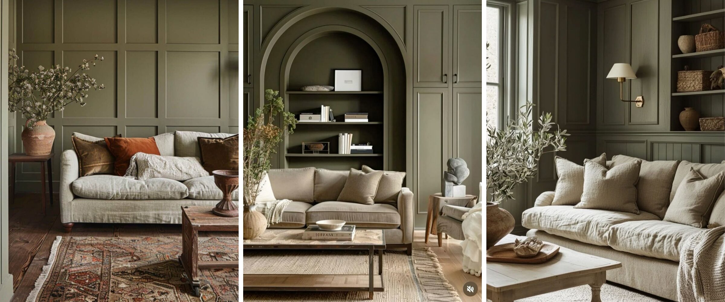
Images via Pinterest.
What is a Whole Home Colour Palette?
A whole home colour palette is simply a set of 5 to 6 core colours—usually a mix of neutrals and a few secondary colours—that are repeated in different ways throughout your home. The goal? To create a sense of flow and harmony as you move from one room to the next.
Now, this doesn’t mean every single wall or piece of furniture needs to be the same colour. Not at all. It just means that the colours in your home should speak the same language—even if they say different things in different rooms.
Think of your home like a storybook.
Each room is a chapter, with its own mood and personality. But together, they tell a cohesive story. When your colours are coordinated, that story feels intentional and beautifully put together—like a novel you don’t want to put down.
Why It Matters
Most people don’t realize just how much colour impacts the way a home feels. When your spaces aren’t connected by a common palette, something can feel… off. Even if each room is beautiful on its own, the house as a whole might feel disjointed or unfinished.
But when your colours flow?
That’s when magic happens.
Here’s why a whole home colour palette is a game-changer:
It Creates Flow and Cohesion
You know that feeling when you walk into a well-designed home and everything just feels right? That’s not by accident. A consistent palette helps your eye travel smoothly from room to room. It’s calming. It’s elegant. And it makes your home feel curated and intentional.
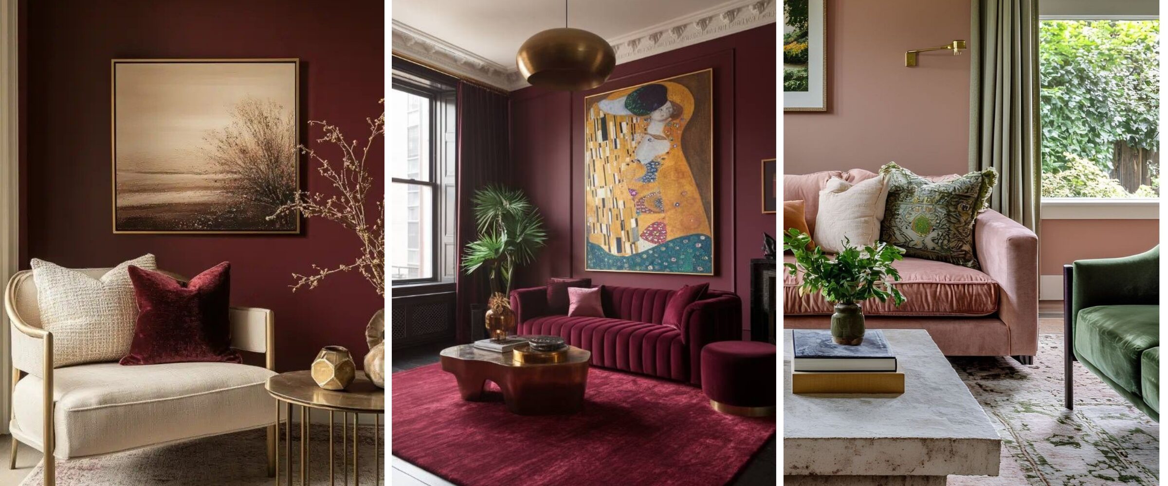
Images via Pinterest.
It Makes Your Home Look More Polished
Even if you’re decorating one room at a time, using a whole home palette ensures everything feels like it belongs together—like a designer pulled it all together just for you (because you did!). Here are 3 secrets to creating a cohesive look across multiple rooms that can help.
It Adds Long-Term Value
Homes that feel cohesive tend to feel more luxurious, even if you didn’t spend a fortune. Whether you’re staying long-term or thinking about resale one day, a thoughtful colour plan pays off.
It Becomes Your Wall Paint Colour Plan
Here’s one of the best-kept secrets: your whole home colour palette can double as your go-to wall paint plan. You’ll already know which colours work well in your space—and how they’ll transition from room to room. Whether you’re painting now or later, you’ve got a roadmap you can trust.
I’m going to talk more about how to take a whole home colour palette and create colour palettes for individual spaces in your home in a future blog post.
Components of a Whole Home Colour Palette
When I’m building a whole home colour palette, I typically start with five to six colours that work together to create a sense of flow, comfort, and consistency from room to room. Think of it as your personal design toolkit—each space might use different tools, but they’re all pulled from the same set.
Why five to six? Because it keeps things simple while still giving me enough flexibility to play around with a few colours. I rarely use every colour in the palette, but having it in place gives me a clear direction—and room to move if a project calls for it.
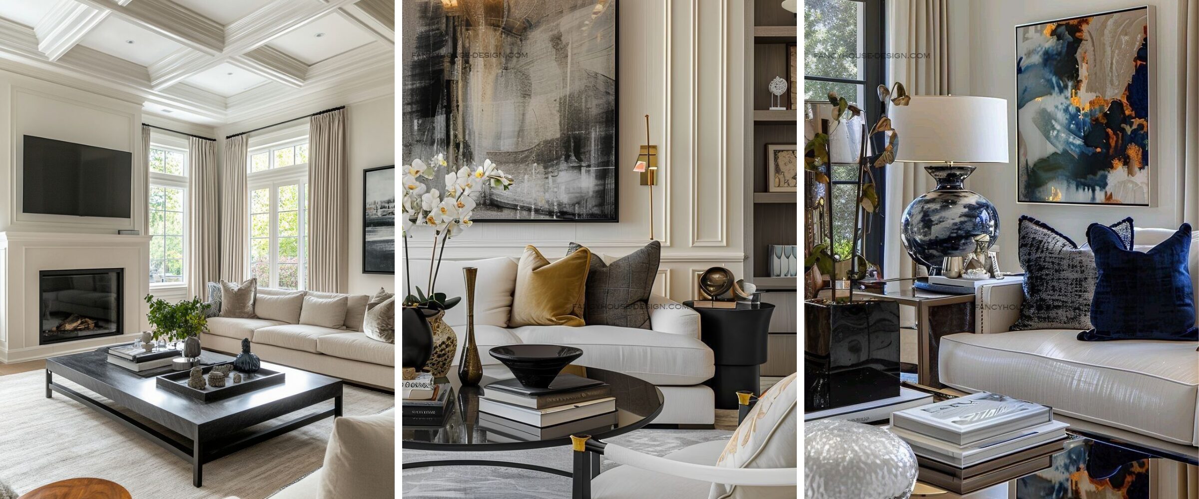
Images via Pinterest.
Here’s how I like to break it down:
1. One Dominant Colour
This is the anchor of your palette. You’ll see it the most across your home—often on some of the more important or bigger spaces. I like this to be a neutral. Something that I can use in big, open concept spaces without overwhelming it for example. It sets the overall tone and mood for your space.
Think: a soft greige, warm white, or barely-there beige.
2. Three to Four Supporting (Secondary) Colours
These colours complement the dominant shade and offer variety from room to room. These are the shades that help each room feel distinct—but still part of the same home. These colours also become the jumping off point for creating colour palettes for individual spaces.
One of my go to tricks for making these colours stretch is to use various shades, tints and tones of these when I’m creating individual room colour palettes. Or if I need another colour for an extra room.
Examples: muted greens, dusty blues, warm taupes, soft clay tones.
3. One Trim Colour
This is typically a consistent neutral—often a white or off-white—used for baseboards, window casings, doors, and ceilings. Using the same trim colour throughout gives the home a polished, unified look, even if wall colours vary.
That said, don’t be afraid to break the rules. While white trim is timeless, I love the impact of a bold trim in the right home—think deep grey, rich navy, or even a soft taupe. If you’re drawn to contrast and drama, coloured trim can be a beautiful way to lean into it.
Some designers include an accent colour in their whole home palette—but I don’t. I prefer to introduce accent colours at the individual room level. It gives me more flexibility and keeps the whole home palette focused and cohesive.
When you apply this palette thoughtfully across your home—mixing and matching these six colours in different ways—you get a space that feels cohesive and intentional, not matchy-matchy or overly coordinated.
Pro tip: The key to success is consistency with variety. Each room doesn’t have to look the same, but the colours should always feel like they’re in conversation with each other.
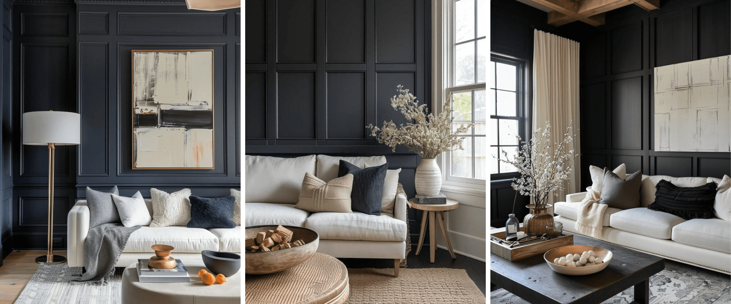
Images via Pinterest.
Common Mistakes to Avoid When Picking Paint Colours
If you’ve ever stood in the paint aisle holding 15 swatches and still walked away confused—you’re not alone. Choosing colours can be tricky, especially without a plan. Here are some of the most common mistakes I see homeowners make when creating (or accidentally not creating) a whole home colour palette:
Picking Colours in Isolation
It’s easy to fall in love with a colour in a showroom or Pinterest photo and decide it’s perfect for your living room. But if that colour clashes with what’s happening in the next room, the overall flow of your home can start to feel chaotic or disjointed. Always consider how a colour fits within the bigger picture of your home.
Ignoring Undertones
Not all whites are created equal—and the same goes for greys, beiges, and just about everything else. Some colours have warm undertones (yellow, red, peach), while others lean cool (blue, green, purple). Mixing warm and cool tones without intention can make things look “off,” even if the colours are beautiful individually.
Overusing Bold Colours Without Balance
Bold colours can be beautiful, but if every room has a strong statement hue without neutral grounding, the home can feel overwhelming. A good whole home palette knows how to balance bold with calm—using neutrals to create breathing room.
Forgetting About Lighting
Lighting plays a huge role in how a colour actually looks. Natural light, artificial light, and even the direction your windows face can affect whether a colour reads warm, cool, dull, or bright. What looks creamy beige in your bedroom might turn slightly greenish in your north-facing hallway. Always test your paint colours in the actual space before committing.
Pro tip: Build your whole home colour palette before choosing individual paint colours. That way, you’re choosing with confidence—not guessing and hoping for the best.
And if you’re looking for fast, easy ways to elevate your space while you figure out your palette, check out these quick design wins you can do in 5 minutes or less.
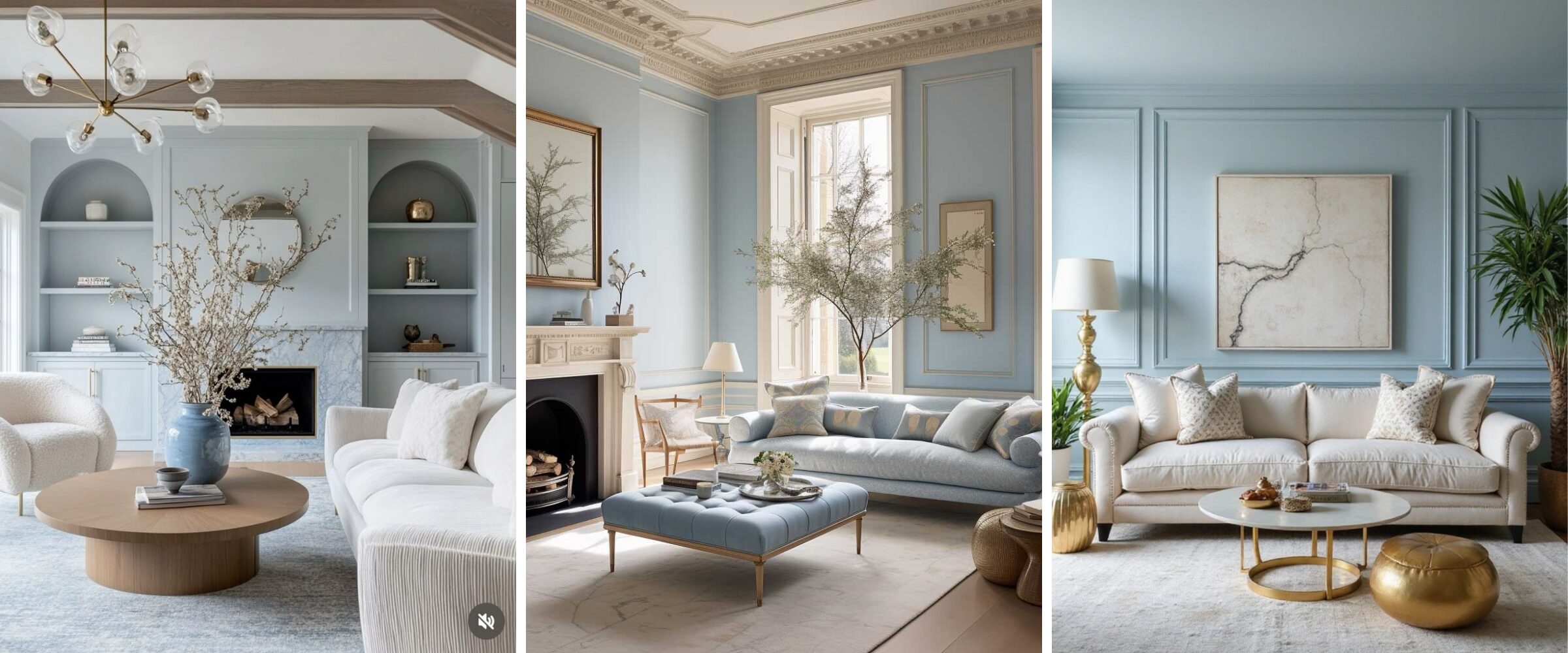
Images via Pinterest.
Final Thoughts
Creating a whole home colour palette isn’t about limiting your creativity. It’s about giving yourself a smart, flexible foundation. It’s the difference between a home that feels disjointed and one that flows effortlessly from room to room. When your colours are in harmony, the entire space feels elevated and intentional—even if you’re decorating just one room at a time.
Whether you’re settling into a new home or ready to finally make your space feel finished, having a whole home palette will save you time, reduce stress, and help you make better, faster decisions along the way.
So the next time you find yourself asking,
“What colour should we paint the walls?”
Start here. Build your palette first—and everything else becomes so much easier.
Here’s a Cheat Code You Can Use Right Away
If you want a quick dose of inspiration, both Benjamin Moore and Sherwin Williams regularly share ready-made whole home colour palettes on their social media channels.
Here’s one from Benjamin Moore that I really like:
And here’s a real-life example from my own previous home:

I didn’t use paint names in the palette itself, but I built the entire look around six core colours. My neutral was a light grey because I wanted the space to feel light and airy—like a summer day. It also worked perfectly with the wood cabinets and grey countertops in my open-concept kitchen.
I used a classic warm white for trim throughout, and for my secondary colours, I chose pink, blue, and dark grey. I even added a touch of gold to lean into my slightly glam style. Every paint colour I chose came from that palette—different shades of grey and blue for the walls, plus a dramatic black accent wall in the living room.
Right now, I’m working on creating a colour palette for my mom’s home, where I’m living at the moment. It’s definitely in need of an update, and I can’t wait to share what I come up with.
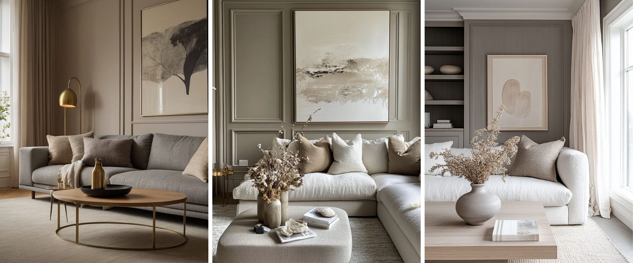
Images via Pinterest.
Not Sure Where to Start? Try Room Rx.
If you’re feeling overwhelmed by colour choices or your home just doesn’t feel cohesive, our Room Rx service was made for you.
It’s a personalized video consultation where I review your space and give you clear, actionable recommendations so everything works together beautifully.
It’s like having a designer in your back pocket—without the big commitment.
👉 Click here to book your Room Rx and start making your home feel more “you”—one smart colour decision at a time.


