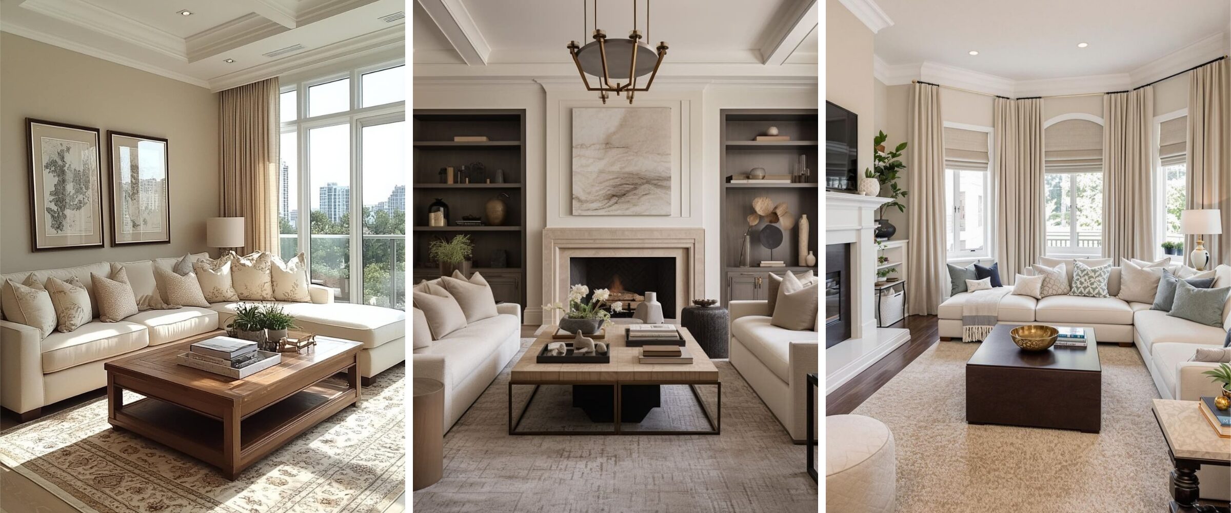
If you’ve been reading my blog for a while, you already know I’m not someone who jumps on every design trend…actually most design trends. Right now, one of the “it” design trends is beige. But here’s the thing. I’ve always loved beige.
You know how most people default to black or grey in their wardrobe? Mine has always been filled with beige. There’s something so effortlessly elegant about it. The reason I mention my wardrobe is because what we wear often reflects how we want to live. And beige, to me, has never been boring. It’s always been the epitome of quiet luxe. Understated, timeless, and endlessly versatile.
So before you roll your eyes at beige making a comeback, let’s take a closer look at why this neutral is having its moment and how to make it work in your home.
Why Beige is Back in Interior Design
Trends are funny things. Colours come and go — one year it’s all about stark white and cool greys, the next it’s earthy terracotta or jewel tones. But beige has quietly slipped back into the spotlight, and this time it looks very different from the builder-basic walls you might remember from the 90s.
So, why the return? Designers (myself included) are gravitating toward beige because it strikes a balance that many homeowners are craving right now: warmth without heaviness, softness without blandness. In a world that often feels fast and overwhelming, beige creates a backdrop that feels calm, timeless, and easy to live with.
Another big reason? The rise of Japandi design style, a blend of Japanese minimalism and Scandinavian warmth. Japandi interiors often favour natural materials, simple forms, and a muted palette where beige feels right at home. Alongside that, the popularity of white oak flooring, cabinetry, and millwork has made warm neutrals the natural complement. Beige walls and furnishings don’t compete with white oak — they enhance its soft, organic beauty.
It’s also worth remembering that beige is more versatile than most people give it credit for. It plays beautifully with natural materials like wood, linen, and stone. It pairs effortlessly with crisp whites or deep charcoals. And when layered with texture and contrast, it has the ability to feel chic, sophisticated, and even luxurious.

Images via Pinterest.
The Mistakes That Make Beige Feel Boring
I’m the biggest nerd when it comes to technology, and if you know me at all, it won’t surprise you that I’ve been geeking out on ChatGPT in every way possible… lol. One of the ways I like to play around with Chat (yep, that’s what I call her) is by asking her to create images of beautifully designed spaces.
But more often than not, I end up disappointed. Why? Because she creates these all-beige living rooms that instantly make me think, this is exactly why everyone thinks beige is boring.
Here’s the thing though: Chat isn’t the only one making these mistakes. In fact, it’s no surprise she falls into the trap. After all, she’s learning from us! And the truth is, most homeowners make the same errors when they try to decorate with beige.
So let’s break down the most common mistakes that make beige feel flat and uninspiring.
Mistake #1: Using one beige everywhere
Walls, sofa, rug, curtains — all in the exact same shade. When everything blends together, the space loses depth and looks monotone. The solution? Mix different tones of beige (lighter, darker, warmer, cooler) so the room feels layered and dynamic.
Mistake #2: Confusing beige and greige
This one comes up all the time. Beige leans warm — with undertones that can read yellow, peach, or even pink. Greige, on the other hand, is a mix of grey and beige, which gives it a cooler, often moodier edge. Choosing the wrong undertone for your space is one of the fastest ways for a neutral room to feel “off.” For example, a pink-beige wall next to yellow-toned oak flooring can clash instead of blend. Testing undertones in your own light is essential.
Mistake #3: Skipping texture and contrast
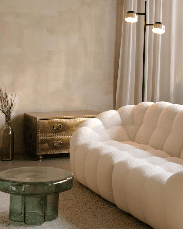
Beige on its own can feel flat — but add a nubby linen pillow, a boucle chair, a wool rug, or matte black hardware, and suddenly the room has depth. Without texture or contrast, even the most expensive beige furnishings can fall flat.
Mistake #4: Buying everything in a matching set
A beige sectional, beige accent chairs, beige tables — all bought as a package — will never feel high-end. The best neutral rooms combine materials (stone, wood, metal, fabric) and shapes to add variety within the palette.
And just to be clear, these mistakes aren’t just about beige. They will apply to any colour you choose.
For the record, “all beige” living rooms can look amazing, if you know how to do it right. I just need to be more patient to train Chat so that she understands what I really want to see.

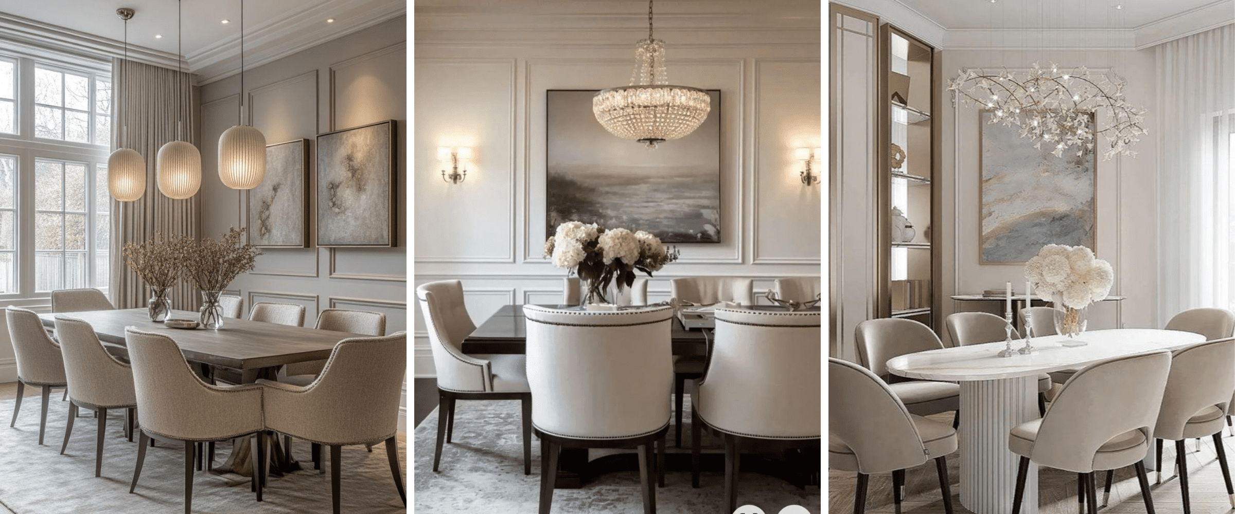
Images via Pinterest.
Designer Tips for Beige That Feels Modern
The truth is, beige isn’t boring. It’s how you use it that makes all the difference. When you add variation, texture, and intention, beige becomes the backbone of a warm, sophisticated, and timeless design. Here are a few of my go-to tips to keep beige feeling modern.
Tip #1: Don’t be afraid to mix in colour and layer tones
Don’t stop at one shade of beige. Combine light, mid, and deeper tones to create subtle contrast. Think pale beige walls, a sandy rug, and a sofa in a deeper stone-beige. This variation instantly adds richness and prevents the flat, “everything blends together” look.
And here’s the thing. Layering doesn’t have to stop at beige. Just because you want beige in your space doesn’t mean you’re locked into a monochromatic palette. Beige mixes beautifully with other colours because it’s a true neutral. One of my favourite pairings is beige with shades of pink — it feels soft, modern, and quietly sophisticated. But it also plays beautifully with blues, greens, or even jewel tones if you prefer more contrast.
Tip #2: Add texture everywhere
Beige comes alive when you play with tactile finishes. Mix linen with boucle, wool with silk, stone with wood. Even if the colours are close, the textural differences create depth and keep the space visually interesting.
Tip #3: Introduce contrast
Neutrals need anchors. Black, deep wood tones, charcoal grey, or even brushed brass can break up the softness of beige and give it a sophisticated edge. A black metal light fixture, dark wood side table, or brass hardware will make your neutrals sing.
Tip #4: Be mindful of undertones and lighting
One of the biggest secrets to making beige work is understanding undertones. A beige with pink undertones will read very differently than one with yellow or green — especially as the light shifts throughout the day. Always test swatches on your actual walls before committing.
Tip #5: Use beige as a backdrop for statement pieces
Because beige is so versatile, it’s the perfect canvas for art, sculptural lighting, or even a dramatic rug. Think of beige as the stage that allows your personality pieces to shine.

Images via Pinterest.
How to Choose the Best Beige Paint Colour for Your Space
Let’s be honest. When you see a colour trending in design, it automatically makes you think of it as a wall colour, no? So, let’s talk about beige on your walls.
You’d think beige would be straightforward, but the truth is, it’s one of the trickiest colours to get right. Why? Undertones.
Every beige has an undertone. Some lean yellow, some pink, some green, and some even a little grey. That’s why the “perfect beige” you saw in a magazine looks completely different once it’s on your walls. Add in the way natural and artificial light shifts throughout the day, and suddenly beige becomes a whole new colour.
Here are a few designer tips to help you land on the right beige:
- Always test large swatches
Tiny paint chips are useless when it comes to neutrals. Paint at least a 2′ x 2′ sample directly on your wall (or use peel-and-stick samples) and look at it morning, afternoon, and evening. - Pay attention to your flooring and fixed finishes
If you have white oak floors, you’ll want a beige with softer, natural undertones so they work together. If your floors are darker wood, a beige with a cooler or greige undertone might balance better. - Compare more than one option
Beige only makes sense when you see it side by side with other shades. That’s when undertones reveal themselves. - Start with a designer-approved shortlist
Want some of my favourites?
- Benjamin Moore Balboa Mist (a beautiful greige that works almost anywhere)
- Sherwin-Williams Accessible Beige (warm but versatile)
- Benjamin Moore Edgecomb Gray (light, airy, and timeless)
The bottom line. Don’t choose beige blindly. The right shade can make your space feel soft, warm, and timeless. The wrong undertone, though, is what leads to the dreaded “boring beige” effect.

Images via Pinterest.
Final Take: Beige as the New-ish Timeless Neutral
At the end of the day, beige isn’t boring. It’s what you do with it that matters. Used carelessly, it can absolutely fall flat. But layered with colour and texture, paired with contrast, and chosen with the right undertones, beige becomes the foundation for a home that feels calm, sophisticated, and timeless.
If you’ve been staring at swatches or second-guessing your neutral choices, you don’t have to figure it out alone. Sometimes it just takes a designer’s eye to spot what’s working (and what’s not). That’s exactly why I created Room Rx. It’s a personalized design prescription that diagnoses what’s off in your space and gives you clear, actionable fixes.
So if you’ve been wondering whether beige belongs in your home or how to make it look high-end instead of flat, Room Rx can give you the clarity you need. Because when you get beige right, it’s anything but boring.


